
CORAL COOL EXPLAINED
UN’s sustainable development goal number 14 concerns life below water. Humans claim ownership over life under water do not acknowledge that it is finite. What does this ignorance and this disconnection mean? We wanted to work through the habits that allow such ignorance to continue and in order to connect them, and make explicit what what suffering humans have brought to underwater ecosystems. Our project is based around the goal’s concrete targets:
14.2 By 2020, sustainably manage and protect marine and coastal ecosystems to avoid significant adverse impacts, including by strengthening their resilience, and take action for their restoration in order to achieve healthy and productive oceans.
14.7 By 2030, increase the economic benefits to Small Island developing States and least developed countries from the sustainable use of marine resources, including through sustainable management of fisheries, aquaculture and tourism.
CORALS
Corals reefs became our focus. Some sources state that 90% of reefs are expected to be at risk from both human activities and climate change by the 2030s and by 2050, it is predicted that all coral reefs will be in danger. Yet they are a direct example of the human-ocean independence, filtering out CO2 and providing as much fresh oxygen for our planet as the Amazon forests. Furthemore, even though many aren’t aware of it, corals are alive. They are living organisms, and indeed very sensitive ones at that: slight water temperature changes of just 1 to 1.5 degrees centigrades can prove deadly for them. Entrenched in the ocean and bombarded by human-caused problems, these not-so-well-understood creatures from familiar ecosystems remained the main concern throughout our ideations.
OUR IDEATION PROCESS

1. FINDING HUMAN-CORAL CONNECTION
Suncream harms corals
We started by considering the poisonous effects of sun cream. Sun cream from people’s skin becomes part of the ocean’s flora and fauna, making the corals sick. The idea of shifting the notion of sun cream into food for corals, who suffer mostly when UV light is blocked, led us to consider designing a hybrid fictional food-like product that would do good for the ocean ecosystem.

2. CONSIDERING THE BIGGER PICTURE
Climate change
Since sunscreen doesn’t have such a meaningful influence on a grand scale, we shifted our focus to global warming, the factor with the most severe impact on coral reefs. High sea surface temperature triggers the loss of zooxanthellae, a symbiotic algae that gives the coral its color, pigmentation and 90% of its energy supply. Coral turns white after expelling its algae symbiont. This bleaching process, if severe, can kill the corals.
3. CHOOSING THE SHAPE OF OUR DESIGN
Coral-friendly ice cream
Facing the fact that some kind of UV light blockage had to be included in our product and that would undeniably hinder the corals’ photosynthesis, we tried to focus on something that would be nourishing for them instead. We considered the beach experience as a whole and thought about the possible ways our product could be packaged. Wanting to make it food-like, we settled upon ice cream popsicles. Then our concept took a new turn: we considered upon designing a nourishing food product to be eaten by both humans and corals alike.

4. CHANGING DIRECTION
Coral-coloring bubbles hidden in ice cream
But what is it actually that humans want to achieve from nourishing the corals? Our users are tourists who want to experience the colors of the now bleaching corals. For this we designed a solution: an ice cream that includes non-edible bubbles of dye. When in contact with the corals, the bubbles color the corals in unexpected colors, making them lively once again.
OUR MESSAGE
We want to create an overview of how people’s choices relate to the ecosystem and the overall picture of ocean life. The metaphor of “liveling” up the corals artificially only to create a pleasant experience for the human eye is a playful way to hint at the deaths of corals and, more abstractly, at the human urge to choose “quick-fix” solutions.
CONVEYING THE MESSAGE
For communicating our message we focused on designing various visual materials, including real-looking advertisement billboards and posters of the ice cream brand, infographics to explain the use of our product, packaging mock-ups and real-life prototypes used for photography.
COLORING
Perhaps humans just want an experience of feeling good about their actions when they are putting effort in nourishing nature? Here we used coloring of corals as a way to keep the audience guessing about the validity of their actions.

SOCIAL MEDIA: APPEALING TO THE SUPERFICIALITY
Our users are tourists who want to experience the colors of the now bleaching corals. We use tourism as a reference to a culture of passive observation that lacks thoughtful engagement. A fake social media account allows us to play into this superficiallity.

THE BUBBLES
The bubbles prove provocative in their strangeness: our product implies a scenario of them spitting out and their contents do not fit the human food category

KNOWLEDGE GENERATED
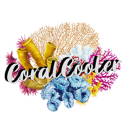
The user testing was conducted throughout our whole process and became an essential part of our iterations. We mainly showed our material and made the users “think-out-loud” during three stages. The first thing we showed was the visual elements like logo, infographics and product pictures. Our visual elements was interpreted as an product and the name “CoralCooler” made the user talk about the raising heat in the oceans.
“Coral reef cooler.. i guess it is getting too warm in the oceans now and it needs to be cooled down”- male 25 yrs
We therefore continued to create a basic structure for our product landing page for more feedback about the narrative experience. All of our users could tell that we were selling something. But an overall confusion grew regarding the functionality of our product. Mainly concerning the balls, which did not come as an suprise due to it being a bizarre feature in our ice-cream.
“This is the thing you dump in the ocean and I guess there’s colors in it but i don’t know if it makes it alive or just colors it?” - female 23 yrs
This led to the users having to scroll up and down in the search for this information which was not being displayed as clear as we wanted. The website needed a deep cleanse in terms of both color scheme and graphics and message. For our final iteration we solved this by adding an auto played conceptual video as our header. We also focused on creating a better narrative flow throughout the scroll with less text and clear infographics. One of them exposed the inner layers and ingredients of the ball. These changes made users think less about the functionality, which was interpreted from the start and a conversation started about the environmental issues that are facing the corals. This was our end goal and we considered our website a success.
“It reminds me of the issue with corals and sunscreen and people also stepping on the corals“ - male 28 yrs